Tuesday, January 3, 2012
BSOM Scenario #3: The Land That Time Forgot
Friday, December 23, 2011
BSOM Scenario #2: The Magic Kingdom
Wednesday, December 7, 2011
BSOM Scenario #1: Life After Floyd
Saturday, November 5, 2011
Making Voices Visible at ArchEX 2011
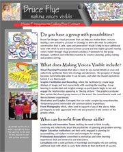
After making two presentations on visual practice at last year's conference of architects in North Carolina, the Virginia conference accepted my proposal to make a similar presentation as one of their many offerings this year. The Prezi file can be viewed below although it will be difficult to follow without the narrative. - A bit about my role with visual practice in a medical school;
- A sampling of the work of others in the field;
- The roots of the practice;
- The various forms that visual practice takes and the functions it serves;
- Some of my own observations and findings (presented as "my humble but correct opinion");
- What this could mean for practicing architects;
- What it has enabled me to do.
ArchEx 2011 on Prezi
Tuesday, October 11, 2011
A Little Bit Goes A Very Long Way
Sometimes it seems like my entire inventory of wisdom is a collection of one-liners from old movies. In this case, there was the scene in Gunga Din where Victor McLaglen's elephant, Annie, was not feeling well. As he began to give her medicine, the attendant interceded, cautioning "No, Sahib, little bit go very long way."During the NACUFS workshop described in the post below, we reached the point when each team was charged with developing and articulating its Idealized Design. As opposed to creating a vision in the way of many practices, the Idealized Design uses the systems knowledge acquired in previous steps to articulate a future and to explain how it works. In this instance, one group asked for additional instruction and clarification as they began.
I offered a quick sketch on an easel, suggesting that they imagine students interacting with their ideal food service. As they visualized the points of contact, they could also look for the next point of contact beyond, and then beyond again, etc. Eventually a fully interactive system would emerge. The explanation only took 2 or 3 minutes.A little while later this incredible assemblage was on the wall. Many of the post-it notes had been accumulating earlier, so they began to organize them in relationships. The rings were pretty straight forward, but the dowels were a fascinating addition. They were left over from an experience we used a couple of nights before to show the importance of focusing on what it is you want. Afterwards, everyone had been bringing their dowels to the sessions. This group realized a new use for them and made the most of it.
Monday, July 18, 2011
Leadership Metaphors Guide Food Service Design
In June I conducted the week-long Planning Institute for the National Association of College and University Food Service for the third time. As a framework for understanding planning processes we use Russell Ackoff's Idealized Design. This year, I decided to experiment with a reflexive activity on leadership.Idealized Design begins with a systems analysis of the current situation, in this instance provided by a fictional case study representing a campus with an assortment of issues. Once their analyses were complete, we asked them to consider the current leadership culture. To do this we used Leadership Metaphor Explorer, a tool developed by the Center for Creative Leadership with a little help from yours truly. All of the cards were spread out on a table, and we asked the 18 participants to review each. They then picked the one that seemed most like their situation or, if none seemed to work, they picked the card that spoke to them in some way.
As they were working in three groups of six, we asked them to
return to their groups and then share their cards and their thinking in turn. Each group was then asked to agree on two cards from their six that seemed to best represent the leadership culture in place on this fictional campus. We then took the two cards from each group and set them aside without discussion.As the week went by they developed their Idealized Designs. Rather than beginning with the usual mission statement, we worked with Steve Haeckel's Reason for Being. Pretty quickly, they produced this statement: "Walnut College Food Service exists to provide students with healthy and sustainable food options in an environment that enables them to become successful individuals." Once each group had drafted its Idealized Design, we borrowed from Appreciative Inquiry and crafted Provocative Propositions to guide the subsequent work as opposed to the traditional gap analysis.
Once they had worked their way through the additional details, we asked them to return to a question of leadership: "What is the leadership culture that will give life to the Idealized Design and its Provocative Propositions?" We repeated the selection of metaphor cards, and then posted both sets for comparison.
The original six, as they described them, depicted a conservative and insular environment. "A Confluence of Agendas" to them represented people each getting something for themselves while the larger whole slowly deteriorated. A "Leaderless Orchestra" to them was an indication of a poorly functioning entity. With the new set, they were quick to see a distinct shift toward an interdependent leadership culture. Even metaphors not normally associated with interdependency had a role in creating it: "Nurturing Parents" reflected the fact that someone would have to teach these new skills and behaviors; "High Performance Engines" described how the college's senior leadership was going to have to step up its game in order to keep up with the dining services group.
I often describe the use of these cards and their companion, Visual Explorer, as greasing the wheels of conversation, and this was no exception. In fact, in their closing reflections one participant described how his usual difficulty with verbalizing concepts was completely overcome by having an image to work from.
Wednesday, May 11, 2011
Visualizing Information with VUE
Over the last several months I have been experimenting with VUE, free software from Tufts University. Generally, it has been used when we needed a group to identify all the pieces and parts of complex projects. For that kind of work it’s much more versatile than scribing on the wall, and it’s easier to clean up and share than sticky notes. The resolution seems to be really good, although I am getting spoiled to using it on a Smart Board.
Most striking, however, has been the way people engage with it: a
s the information begins to accumulate and breed more information, attentiveness to the screen builds. There’s no other practice I’ve used that seems to create that kind of rapt attention and mental processing. Having recently used it on an especially complex and important initiative here in our medical school, I asked two senior leaders who were involved to share their thoughts via a POINt inquiry:
- The most positive aspects? Could get ideas out quickly, and begin to see myriad interactions and decision issues; “It was kind of fun, too;”
- Opportunities? Good for early stage planning, especially on projects that are at all dynamic in time, or have significant complexities;
- What issues are there? Not linear enough to assure completeness, and too informal to be completely comfortable with its reliability; sometimes ideas flowed faster than the keyboard operator could capture them;
- What new thinking might address the issues? Add another layer of organization - develop a map with the group when it is brainstorming and then ask someone to put the information into a more traditional format with chronological tracking of some kind.
(Note: this last image is deliberately low resolution as the content does not lend itself to broadcasting.)
